CASE STUDY
Branding, Layout and Collateral Design, Illustration.
The Blue Peter
The Blue Peter is a one-of-a-kind sailing yacht that offers summer charters in Nantucket and Martha’s Vineyard. Launched in 1930, The Blue Peter is almost 100 years old and is a completely unique piece of history.The Blue Peter had all of the makings of a great brand, but she was lacking a cohesive and robust brand identity. Besides a website and a simple business card, Mat Barker, Captain and Owner of The Blue Peter, had no branding or collateral.
So far, his business had been supported by local Nantucket connections and word of mouth. With the summer charter season well underway and unfilled charter slots, Mat reached out to Stephanie for a full brand refresh.
Challenge
The Blue Peter had only a very basic level of branding that didn’t speak to its history, offerings or personality. The challenge was to create a holistic brand identity that that would easily translate to the Nantucket summer residents and vacationers. Further, the brand needed a way to communicate it’s offerings to the target market.
USPs
A classic, completely unique wooden sailboat
A tailored, intimate experience
Fair pricing
Small, local company
Solution
The Asks
More visibility in the right places
More charters for the season
Ability to start elevating prices
The Obstacles
No current branding or materials besides website, business card and brand mark
Brand mark does not encapsulate the look and feel of the boat or experience
Inability to get the information out there
Stephanie’s intention was to craft a cohesive brand for The Blue Peter that highlighted it’s history and personalized, luxury offerings.
In order to combat The Blue Peter’s lack of market visibility, Stephanie planned to create a set of clean, informative and visually appealing collateral, including business cards and flyers, that could be passed out by Captain Mat, local hotels and businesses around Nantucket. This would create a sense of legitimacy from trusted referral sources and allow for a physical brand presence on the island.
Design Process
Brief
Market/ Competitor Research
Concept
Review
Initial Concepts
Concept Development
Design
Review
Adjustments
Approval & Execution
Competitor Analysis
Target Market
fter talking to Mat in depth, Stephanie had a clear idea of his existing clientele, his target market and his competitors. Most charter clients were Boomer and Gen X couples and families either visiting the island or vacationing for the season. According to research, both of these generations have a good amount of disposable income, but are largely motivated by value and quality. Because of this they don’t just go with the first or lowest offer they come across. Quality and trustworthiness are very important to them and they will remain very loyal to a brand they know and trust.
Mood Boards
Old Money Cape
Focuses on the history, old world charm and the hand-crafted nautical side, paying homage to the uniqueness of The Blue Peter. Colors can be richer, pulling in some reds, oranges or purples that you see in the flags. Logo style is more hand-crafted and illustrative. Typography is slightly more classic, utilizing for serif and old-style fonts. Plays up the quintessential Nantucket look and feel.
Summer Breeze
Focuses on the seasonal, exciting and freeing nautical side, while maintaining a crisp and elevated brand style. Colors can start in the deep blues and move towards teal and green, perhaps adding some contrasting oranges that nod to the wood on The Blue Peter. Typography can be a little more clean and sophisticated, but still fun. Logo style can be more transitional, with a mixture of old and new—not super simplistic but not completely traditional.
Clean & Chic
Focuses on the luxurious, high end nautical side. Colors are more neutral, with deep, cool blues, grey-blues, off-white and tan. Logo, typography and imagery are very clean and minimal.
Feedback
After reviewing and talking through each possible brand direction, Mat was enthusiastic about the “Old Money Cape” brand direction that played up the classic old-world charm and hand-crafted style of the East Coast. He was confident this would align well with his target market and felt it perfectly reflected his sailing yacht and charters.
Color Scheme
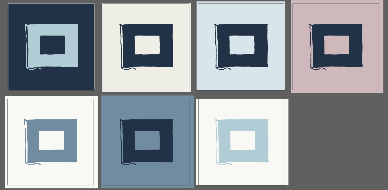
Stephanie used inspiration from the from the island to create The Blue Peter color palette, pulling from the island sunsets, vintage sailing flags and advertisements and, of course, the classic “Nantucket Red”. It was important to create a palette reminiscent of the American flag without pulling too strongly in that direction.
Logo & Brand Mark
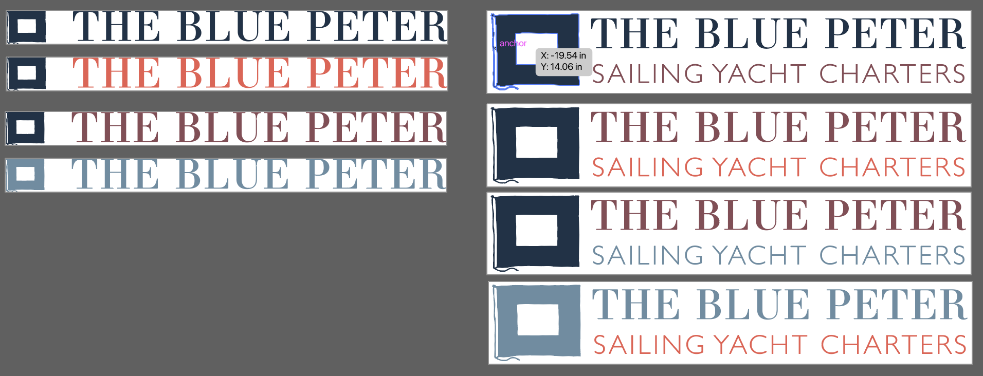
While Captain Mat was happy to have the brand mark revamped, he was adamant about keeping the Blue Peter flag for the logo and that it remain a blue (otherwise it would be a different flag). The previous brand mark was not easily recognizable as the Blue Peter flag and had a more technology-based brand style to it. So, with these points in mind, Stephanie got to work crafting a hand-drawn nautical flag illustration that gave a nod to the historic sailing societies and clubs. To make sure it was somewhat modern, she kept the design minimal. By adding the established date, Stephanie drew on the historic aspects and craftsmanship of the boat itself. Lastly, she used a sharp modern serif font for “The Blue Peter”, making sure it matched well with the same font used on the boat itself.


Typography
Stephanie kept the typography a mix of classic serif and clean sans serif. Charter Roman would allude nicely to the classic old money sailing aesthetic without being too on the nose. She used Gill Sans Light, a humanist typeface popular during the 30s in honor of The Blue Peter’s 1930 launch. The two fonts together create a nice visual contrast.
Design Elements
To match the logo and add another visual level to the brand personality, Stephanie hand-made digital illustrations that could be used on the website, in emails and social media posts. The illustrations are easily recognizable for ““Contact, “Charters”, “Merch” and “Private Events”.
Stephanie next created a pattern that could be used for backgrounds and dividers. She pulled inspiration from topographic ocean maps and abstract ocean ripples, applying the same hand-drawn style to it.




Photography
Inspired by vintage Kennedy sailing photographs and Ralph Lauren magazines, Stephanie added a handmade filter to photos of happy charter guests and The Blue Peter to recreate a printed magazine style photo.
Printed Collateral
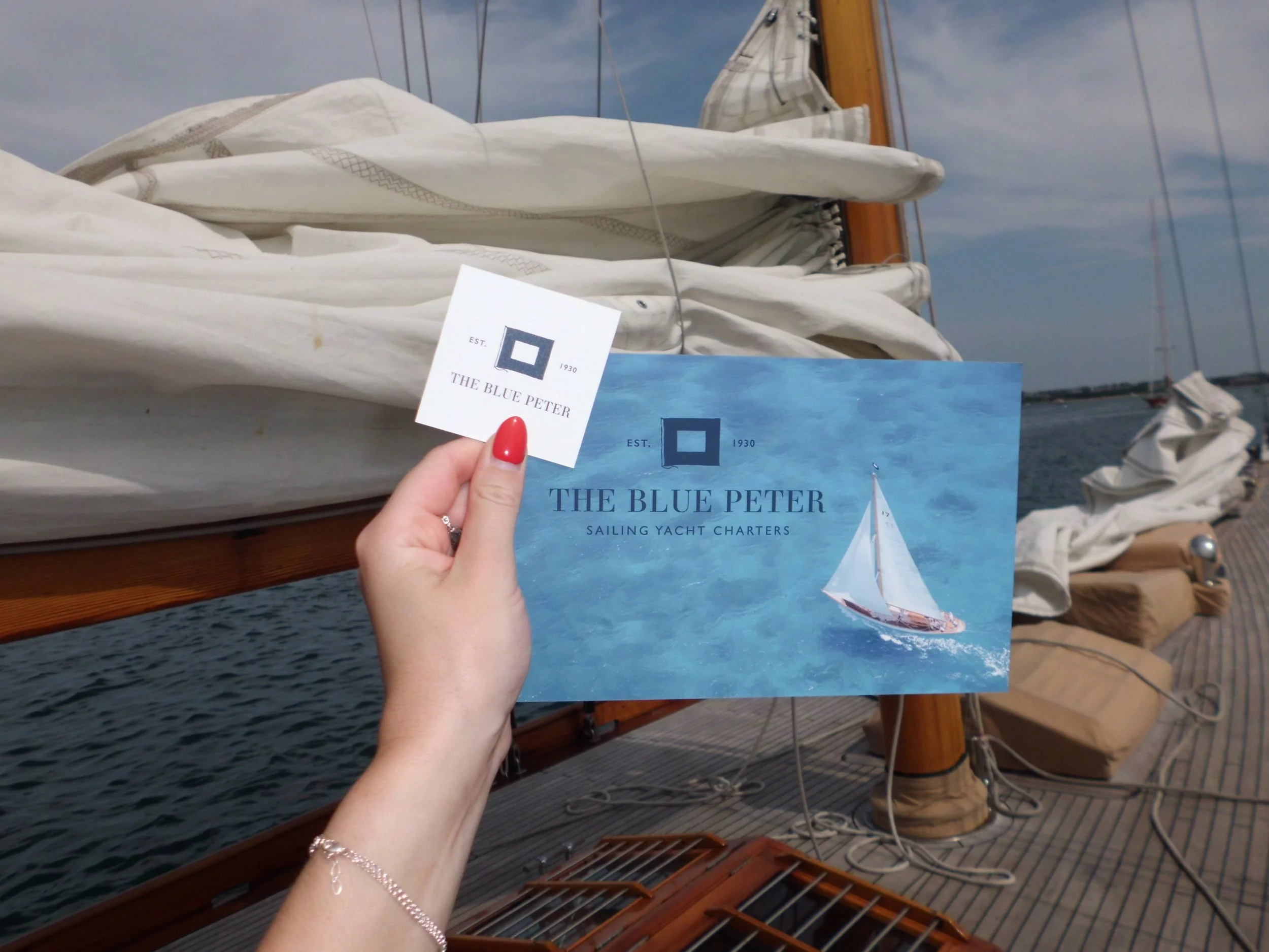
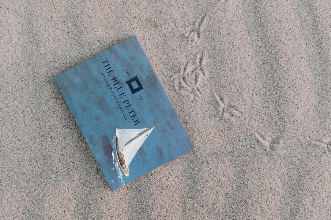
Due to an end-of-season time crunch, Stephanie focused on designing a small collection of branded collateral for Mat and local businesses or friends to hand around town. It was important that both pieces were memorable yet easily packed away so potential guests wouldn’t be tempted to throw them away. She settled on a clean one-page flyer instead of an elaborate multi-page brochure. This way the viewer would get all of the pertinent information they needed with just a quick scan. Stephanie created several iterations of the business card layout from which Mat then selected his favorite.


Adjustments
Unfortunately, the illustrated topographic “wave” background was not sitting well with Stephanie, as it read a bit more playful and generic than she wanted for a high-end brand like The Blue Peter. She went back to the drawing board and eventually found a collection of the National Weather Service’s marine weather forecast maps. Intrigued by the similar curved lines, grid and the authentic forecast details, she outlined the images and created two background elements that would enhance and add depth to the brand.
While the brand design itself is finalized and the printed collateral were able to be finalized and printed before the end of the charter season, Stephanie and Captain Mat decided to take a much deserved breather before diving into the web design. The website design is currently in progress and will be launched Spring 2025 to prepare for the upcoming season.
Final
Design


